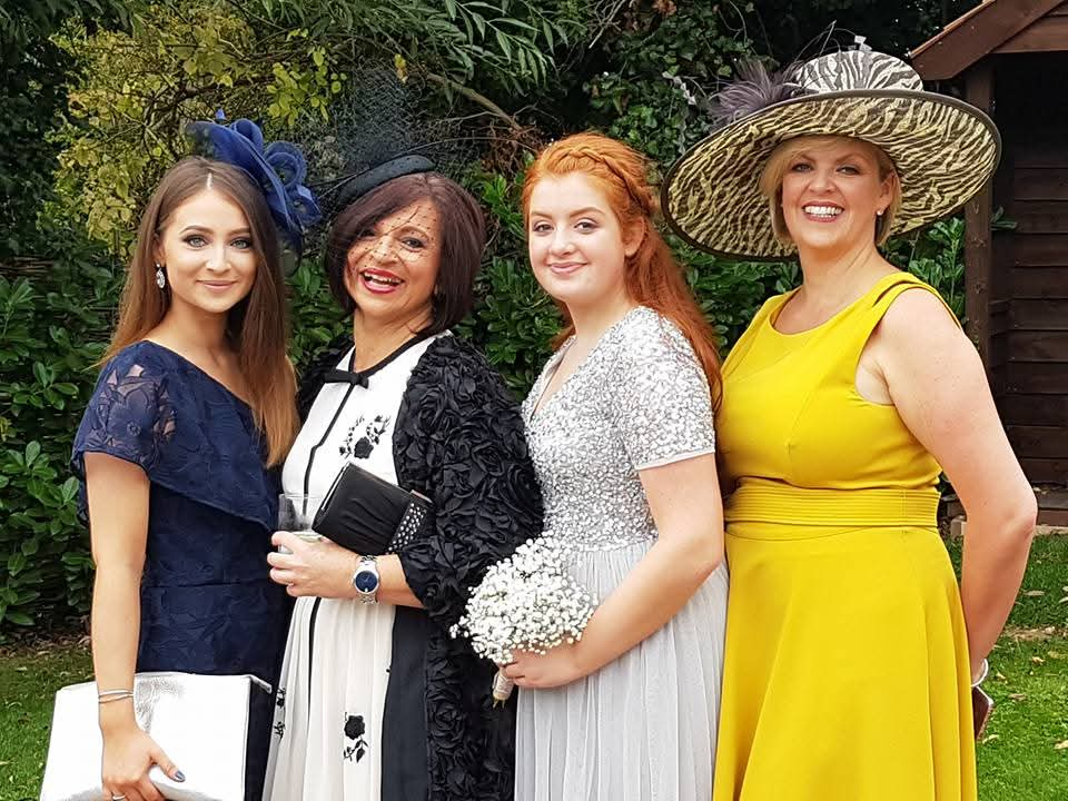


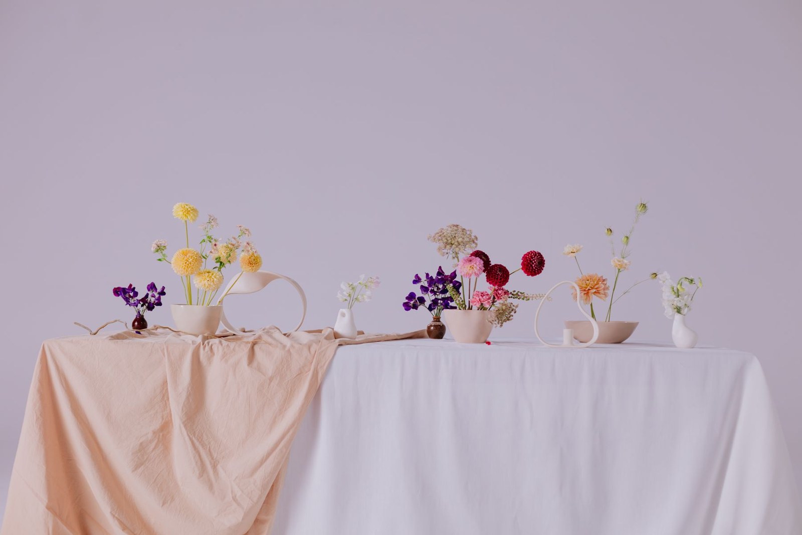
I would start with the feeling you want, rather than a colour chart. Do you picture a lively gathering, a quiet moment or something somewhere between? Colours can help set that tone, but they don't need to match perfectly to feel connected.
Look at the place where you'll gather. A garden already brings its own greens and seasonal colour; an indoor room may have strong curtains, carpets or woodwork. Choose two or three shades that work with what is there, rather than trying to hide the setting. Check samples in the light you'll actually use, because daylight and warm lamps can change how a colour looks.
Personal details are a useful starting point. A favourite piece of clothing, a family photograph or a flower you associate with someone can suggest a palette that means more than a current trend. For a naming or milestone celebration, the colours can reflect the person at its centre. You can keep the ceremony itself simple and carry the colour through invitations, ribbons or a few table details.
Printed words need to be easy to read. Dark lettering on a pale, uncluttered background is usually clearer than two similar shades together. Try a printed sample at its final size, and don't rely on colour alone to show important information. Guests should be able to follow a reading or find their place comfortably.
You don't have to bring colour into every part of the day. One repeated detail can be enough, and the words, people and promises remain at the heart of the ceremony. I can help you think about where a personal detail belongs without letting it take over the story.